18 Academic Task 1 Practice Questions
Real Task 1 questions with the original charts, grouped by visual type. Give yourself 20 minutes and at least 150 words for each.
Every one carries the same instruction: Summarise the information by selecting and reporting the main features, and make comparisons where relevant. Write at least 150 words.
Line graph questions
How to answer line graph questions →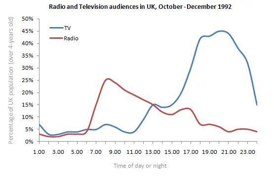
The line graph shows radio and television audiences throughout the day in 1992.
Summarise the information by selecting and reporting the main features, and make comparisons where relevant.
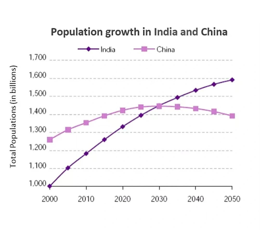
The graph below shows the population for India and China since the year 2000 and predicts population growth until 2050.
Summarise the information by selecting and reporting the main features, and make comparisons where relevant.
Bar chart questions
How to answer bar chart questions →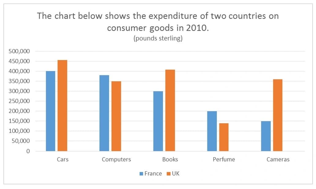
The bar chart shows the expenditure of two countries in consumer goods in 2010.
Summarise the information by selecting and reporting the main features, and make comparisons where relevant.
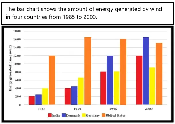
The bar chart shows the amount of energy generated by wind in four countries from 1985 to 2000.
Summarise the information by selecting and reporting the main features, and make comparisons where relevant.
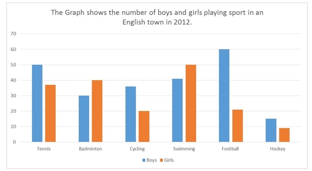
The graph shows the number of boys and girls playing sport in an English town in 2012.
Summarise the information by selecting and reporting the main features, and make comparisons where relevant.
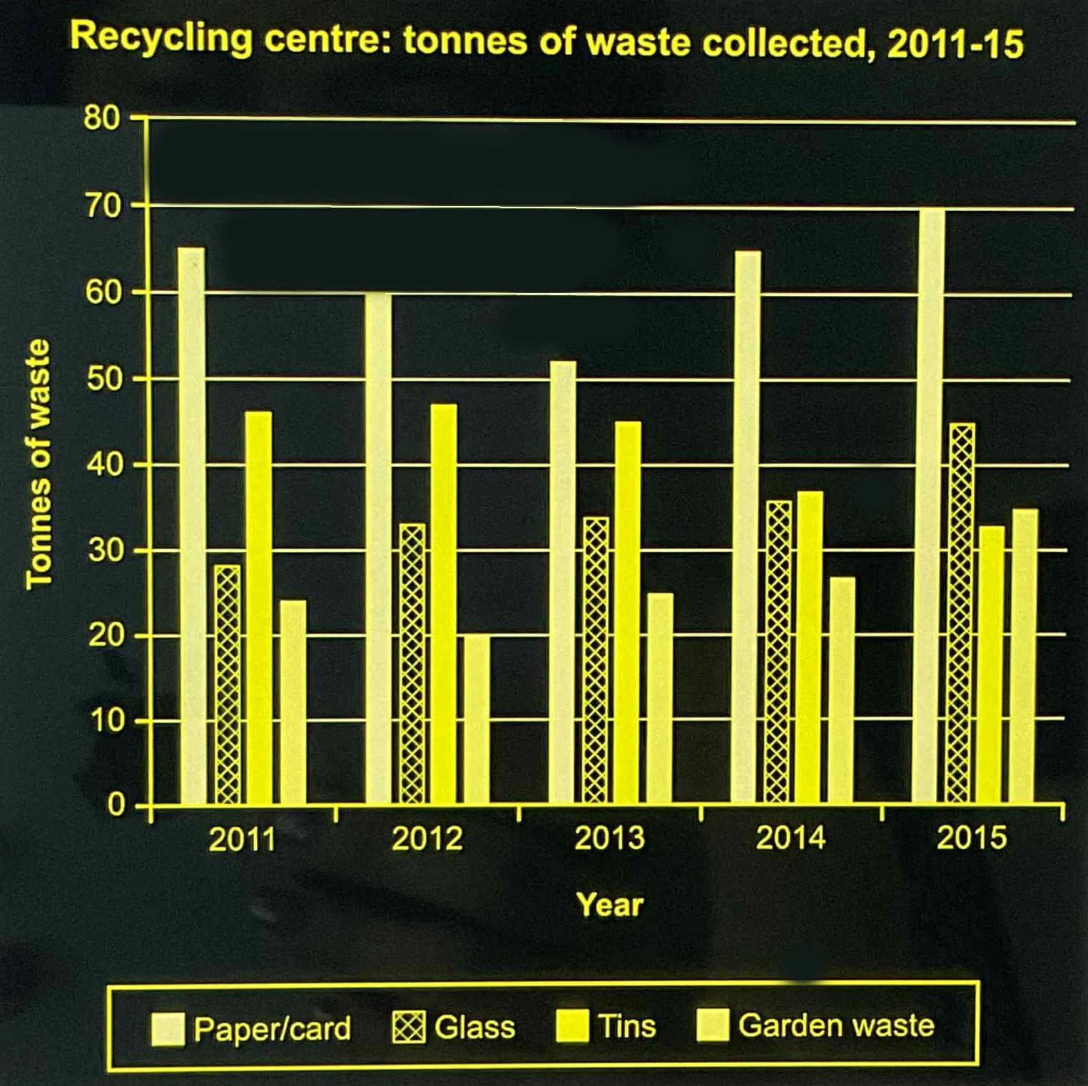
The chart below shows the amount and type of waste collected at a recycling centre in one UK town between 2011 and 2015.
Summarise the information by selecting and reporting the main features, and make comparisons where relevant.
Pie chart questions
How to answer pie chart questions →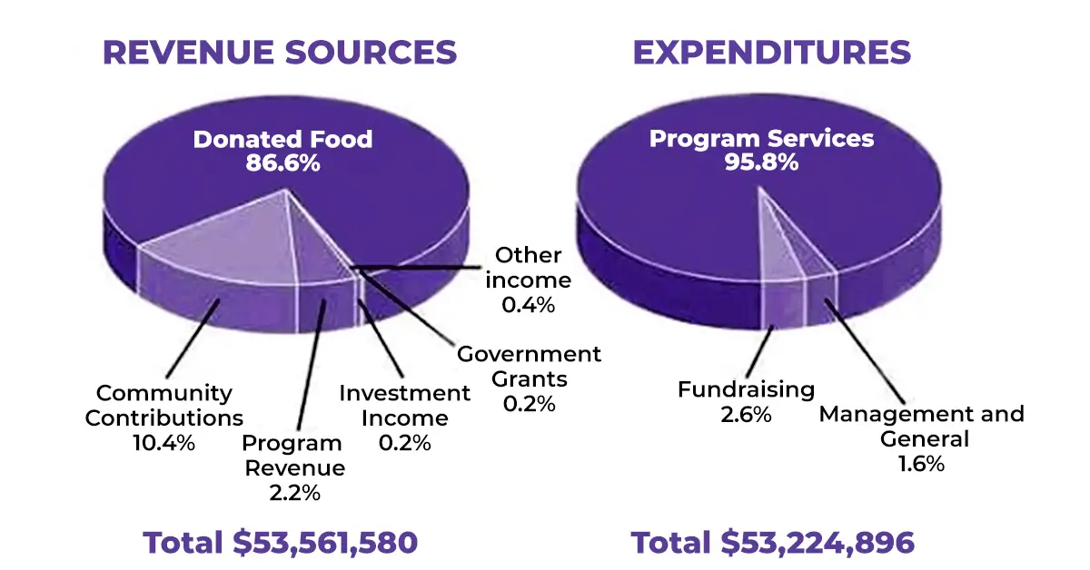
The pie chart shows the amount of money that a children’s charity located in the USA spent and received in one year.
Summarise the information by selecting and reporting the main features, and make comparisons where relevant.
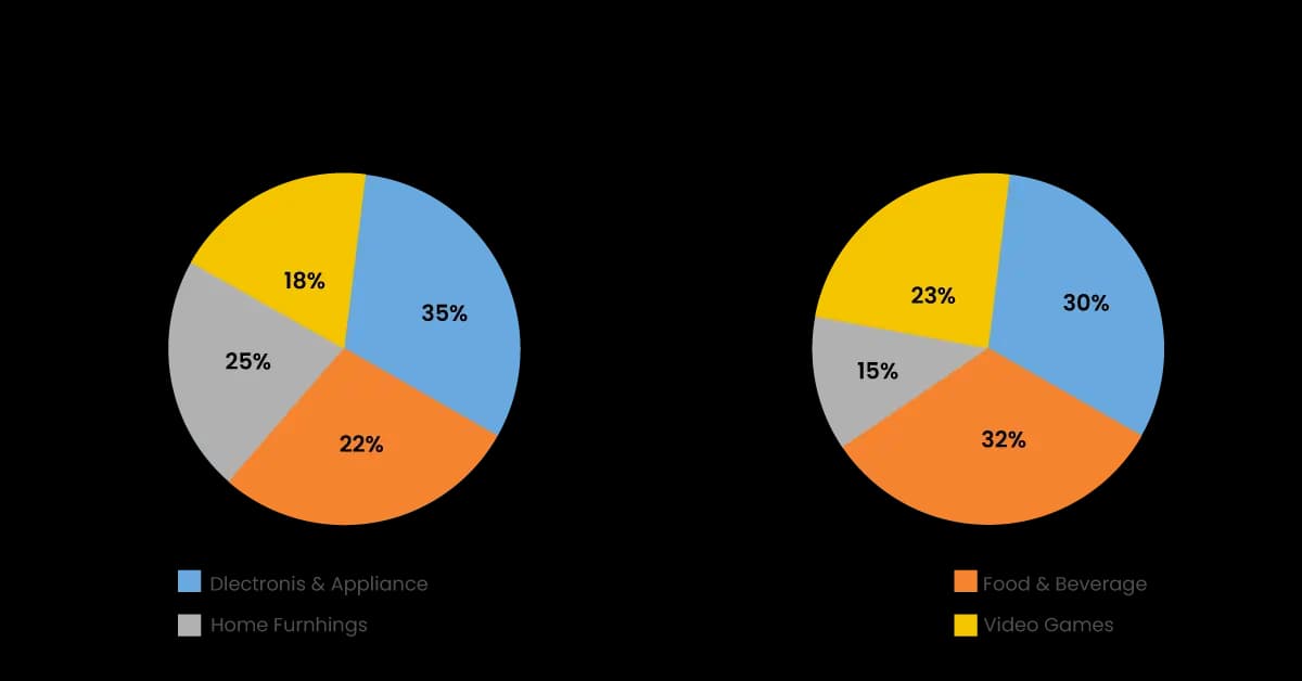
The two pie charts show the online shopping sales for retail sectors in Canada in 2005 and 2010.
Summarise the information by selecting and reporting the main features, and make comparisons where relevant.
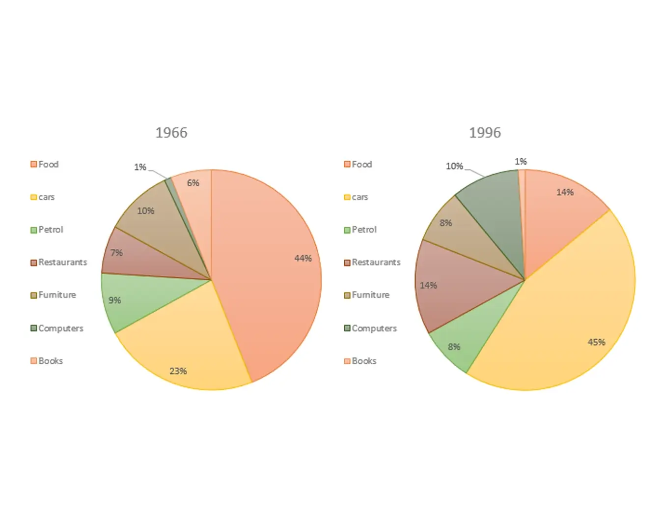
The given pie charts compare the expenses in 7 different categories in 1966 and 1996 by American Citizens.
Summarise the information by selecting and reporting the main features, and make comparisons where relevant.
Table questions
How to answer table questions →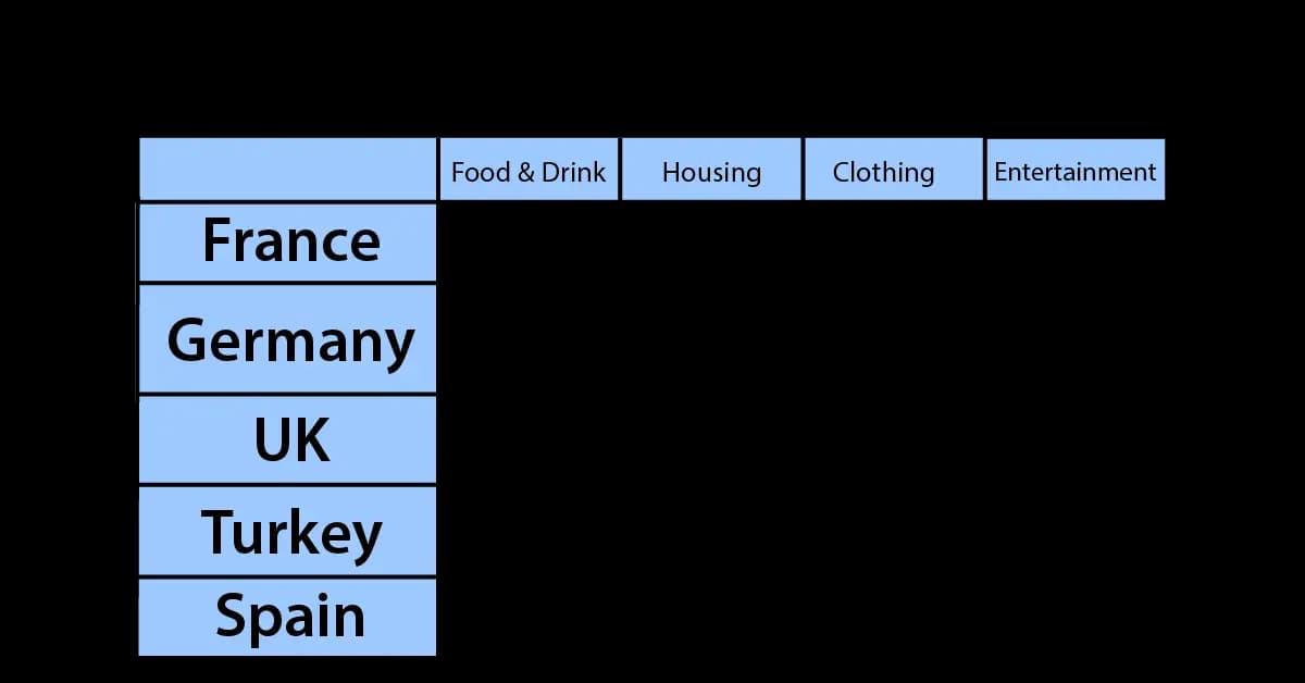
The table illustrates the proportion of monthly household income five European countries spend on food and drink, housing, clothing, and entertainment.
Summarise the information by selecting and reporting the main features, and make comparisons where relevant.

The table shows the monthly expenditure of an Australian family in 1991 and 2001.
Summarise the information by selecting and reporting the main features, and make comparisons where relevant.
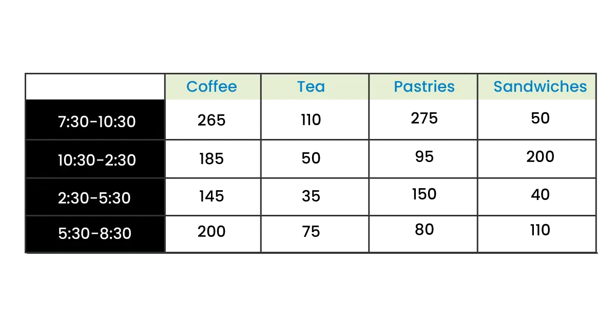
The table shows sales made by a coffee shop in an office building on a typical weekday.
Summarise the information by selecting and reporting the main features, and make comparisons where relevant.
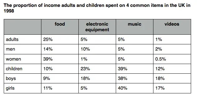
The proportion of income adults and children spent on 4 common items in the UK in 1998.
Summarise the information by selecting and reporting the main features, and make comparisons where relevant.
Process diagram questions
How to answer process diagram questions →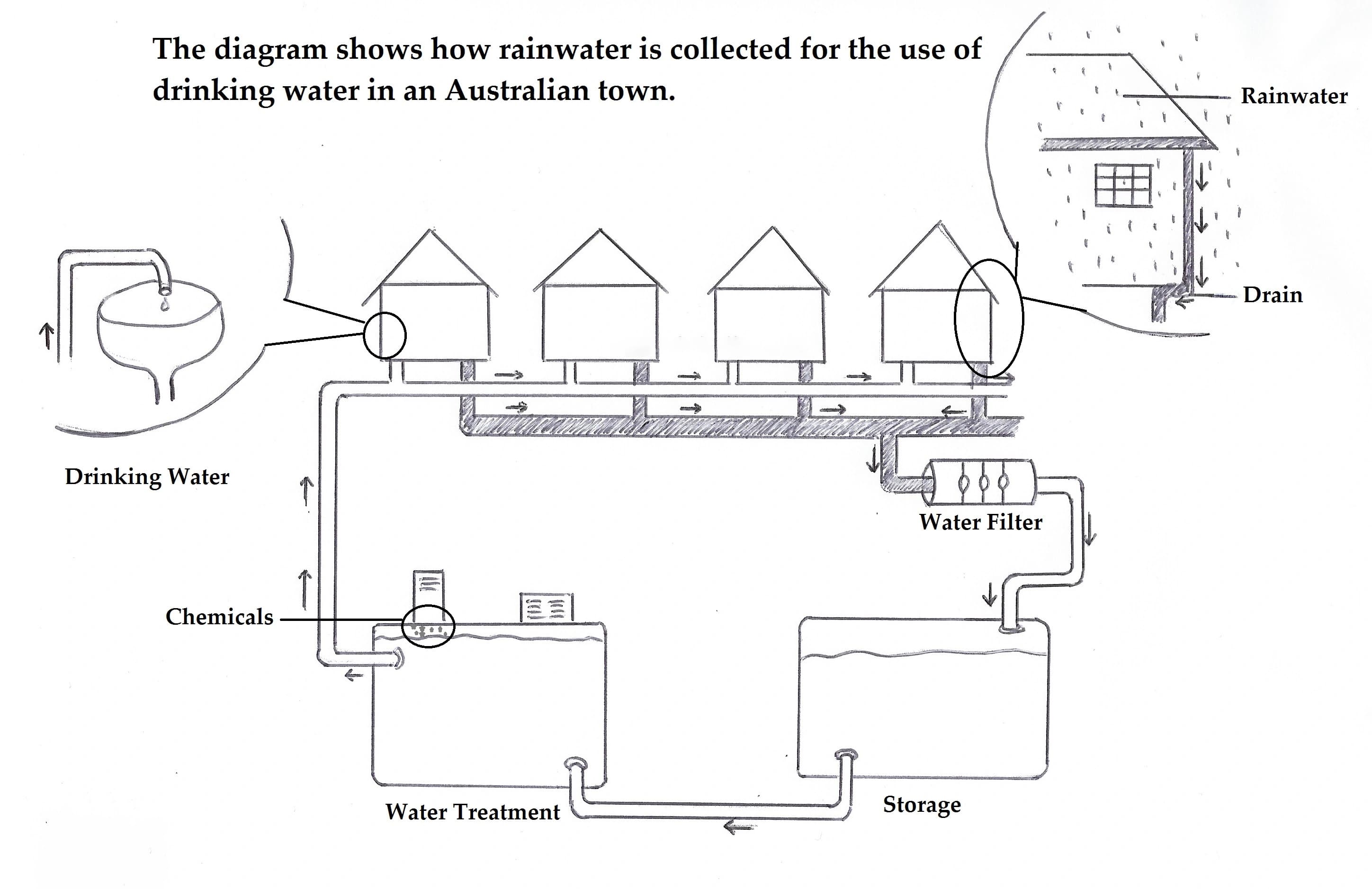
The diagram shows how rainwater is collected for the use of drinking water in an Australian town.
Summarise the information by selecting and reporting the main features, and make comparisons where relevant.
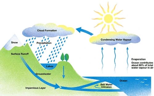
The given diagram shows the water cycle.
Summarise the information by selecting and reporting the main features, and make comparisons where relevant.
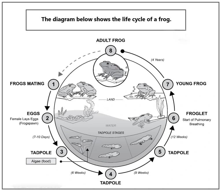
The diagram shows the life cycle of a frog.
Summarise the information by selecting and reporting the main features, and make comparisons where relevant.
Map questions
How to answer map questions →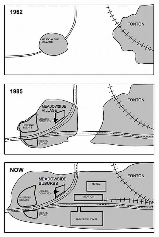
The maps show the changes that have taken place in Meadowside village and Fonton, a neighbouring town, since 1962.
Summarise the information by selecting and reporting the main features, and make comparisons where relevant.
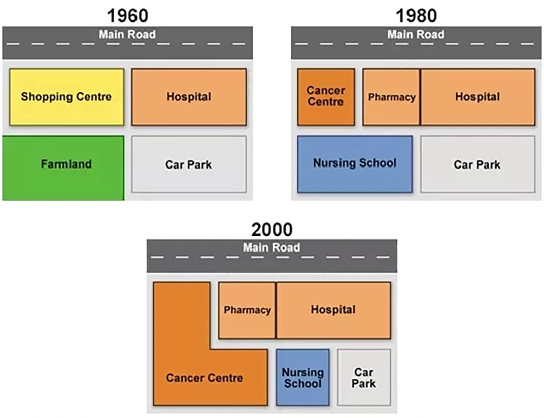
The diagrams below show the changes that have taken place at Queen Mary Hospital since its construction in 1960.
Summarise the information by selecting and reporting the main features, and make comparisons where relevant.
Get your Task 1 answer marked
Task 1 rewards drilling, because the question types repeat. Write one of these, get a band for all four criteria, and see exactly which sentence lost the mark.