IELTS Writing Task 1: Line Graphs
Line graphs are the most common Academic Task 1 question. They test one thing above all: whether you can describe how something changed over time instead of reading numbers off the page one by one.
What the question looks like
One or more lines plotted against a time axis. Check the axis before you start — if it extends into future years, the graph is forecasting, and that changes the tenses you need for the last part of your answer.
The instruction line is the same on every Academic Task 1 question: Summarise the information by selecting and reporting the main features, and make comparisons where relevant. You have about 20 minutes and need at least 150 words.
The overview sentence
Say which direction things moved overall and which line finished highest and lowest. Keep figures out of the overview entirely — they belong in the body paragraphs.
Overall, television audiences were consistently larger than radio audiences throughout the day, and both media showed two clear peaks rather than holding steady.
How to structure the answer
- 1
Introduction
Paraphrase the question in one sentence. Change the reporting verb, swap the nouns for synonyms, and keep the time period and units exactly as given.
- 2
Overview
Two sentences: the overall direction of change, and the widest gap or the highest and lowest points. No data at all.
- 3
Body 1
Group the lines that behave similarly and describe them together, supported with figures and dates.
- 4
Body 2
Do the same for the remaining lines, and point out any crossover where one line overtakes another.
Language for line graphs
Lexical Resource is a quarter of your Task 1 mark. These are the phrases this question type actually calls for.
- Verbs of change
- roseclimbedsurgedfelldeclinedplummetedlevelled offplateauedfluctuated
- How fast it changed
- sharplydramaticallysteadilygraduallyslightlymarginally
- Noun forms, for variety
- a sharp rise ina steady decline ina slight fluctuation ina gradual recovery in
- Peaks and troughs
- peaked atreached a high ofbottomed out athit a low of
- Only when the graph forecasts
- is expected tois projected to reachis forecast to overtake
Mistakes that cost marks
- Describing every data point on the line.
- Select. The start, the end, the peak, the trough and any crossover — that is usually all you need.
- Writing in the present tense about a period that has ended.
- Match the tense to the axis. Past years take the past simple.
- Reporting forecast figures as though they already happened.
- A graph predicting to 2050 needs 'is projected to reach', not 'reaches'.
- Leaving out the overview.
- No overview caps Task Achievement at band 5 however good the rest of the answer is.
- Dropping the units.
- If the axis says millions or percent, every figure you quote needs it.
Line Graphs: sample questions
Real line graph questions in the exam format. Give yourself 20 minutes and 150 words for each.
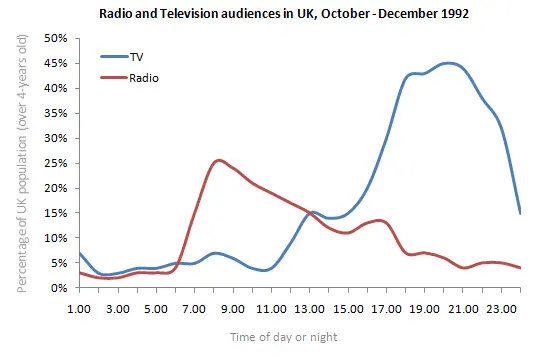
The line graph shows radio and television audiences throughout the day in 1992.
Summarise the information by selecting and reporting the main features, and make comparisons where relevant.
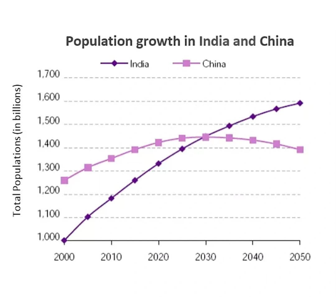
The graph below shows the population for India and China since the year 2000 and predicts population growth until 2050.
Summarise the information by selecting and reporting the main features, and make comparisons where relevant.
Find out what your answer would score
Reading about line graphs only takes you so far. Paste an answer in and get a band for Task Achievement, Coherence and Cohesion, Lexical Resource and Grammatical Range, with the corrections that would raise it.