IELTS Writing Task 1: Pie Charts
Pie charts are about proportion, not quantity. Where candidates lose marks is with two or more pies: describing each chart separately reads as two half-answers, when the question is asking what changed between them.
What the question looks like
One pie showing how a whole divides, or two or more pies comparing the same categories across dates or places. Segments are usually percentages totalling 100.
The instruction line is the same on every Academic Task 1 question: Summarise the information by selecting and reporting the main features, and make comparisons where relevant. You have about 20 minutes and need at least 150 words.
The overview sentence
Give the largest and smallest segment. With more than one pie, the overview should say what shifted most between them rather than describing either chart.
Overall, clothing and footwear made up the largest share of online sales in both years, although its dominance had fallen noticeably by 2010 as electronics gained ground.
How to structure the answer
- 1
Introduction
Paraphrase the prompt, keeping the categories and both dates.
- 2
Overview
The largest and smallest share, or with multiple pies, the biggest shift between them.
- 3
Body 1
The dominant segments, with percentages, compared across the charts.
- 4
Body 2
The smaller segments, and any that swapped position between charts.
Language for pie charts
Lexical Resource is a quarter of your Task 1 mark. These are the phrases this question type actually calls for.
- Proportion nouns
- the proportion ofthe share ofthe percentage ofthe figure for
- Verbs
- accounted formade uprepresentedconstituted
- Fractions, for variety
- a quartera thirdjust under halfthree quarters
- Approximating
- just overjust underalmostapproximatelyroughly
- Change between charts
- rose by four percentage pointsdoubledhalvedovertook
Mistakes that cost marks
- Saying a share 'increased by 10%' when it rose ten percentage points.
- A rise from 20% to 30% is ten percentage points, not a 10% increase. They are different claims.
- Describing two pies as two separate answers.
- Compare them category by category so the reader sees the change.
- Giving all seven segments equal weight.
- Select. Two or three segments carry the story; group the rest.
- Mixing up 'percent' and 'percentage'.
- Write '25 percent' but 'the percentage of'.
- Assuming both pies represent the same underlying total.
- Both total 100%, but the real quantities behind them may differ. Say 'share', not 'amount'.
Pie Charts: sample questions
Real pie chart questions in the exam format. Give yourself 20 minutes and 150 words for each.
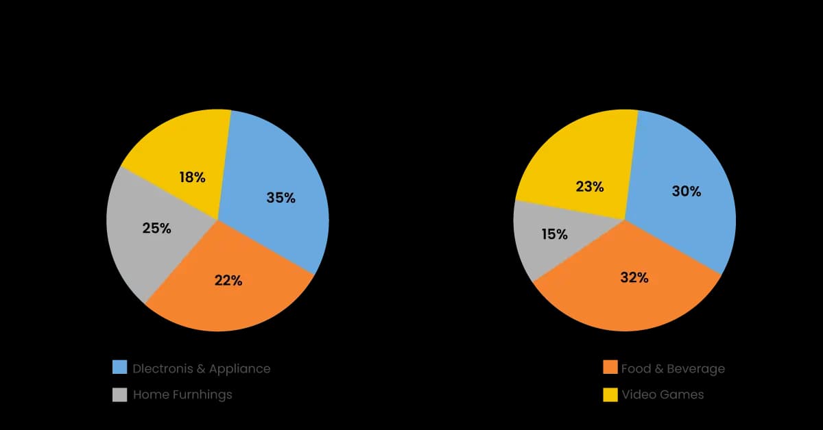
The two pie charts show the online shopping sales for retail sectors in Canada in 2005 and 2010.
Summarise the information by selecting and reporting the main features, and make comparisons where relevant.
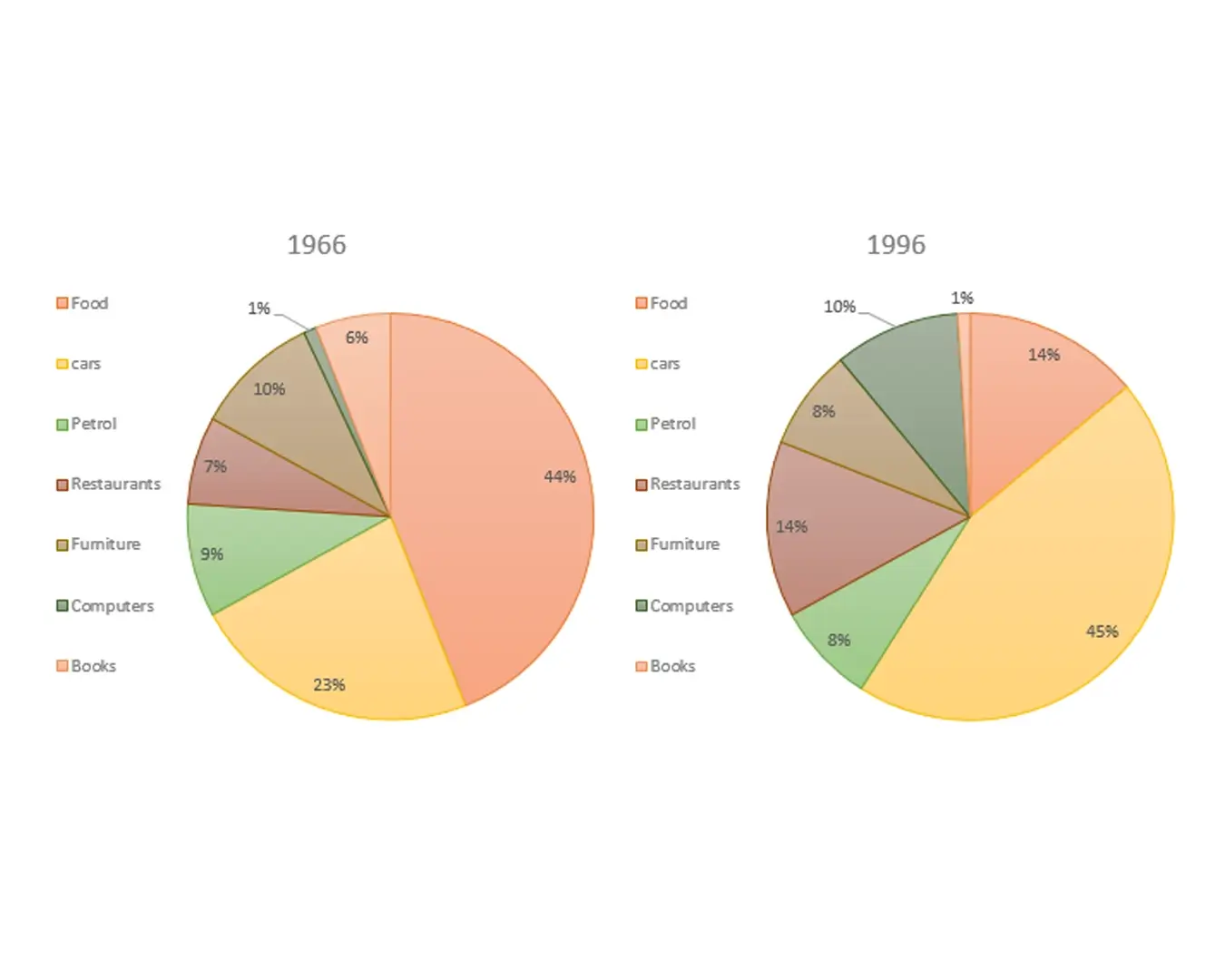
The given pie charts compare the expenses in 7 different categories in 1966 and 1996 by American Citizens.
Summarise the information by selecting and reporting the main features, and make comparisons where relevant.
Find out what your answer would score
Reading about pie charts only takes you so far. Paste an answer in and get a band for Task Achievement, Coherence and Cohesion, Lexical Resource and Grammatical Range, with the corrections that would raise it.